I’m sorry to ruffle some feathers, but we’ve been doing resource directories all wrong.
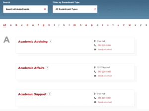
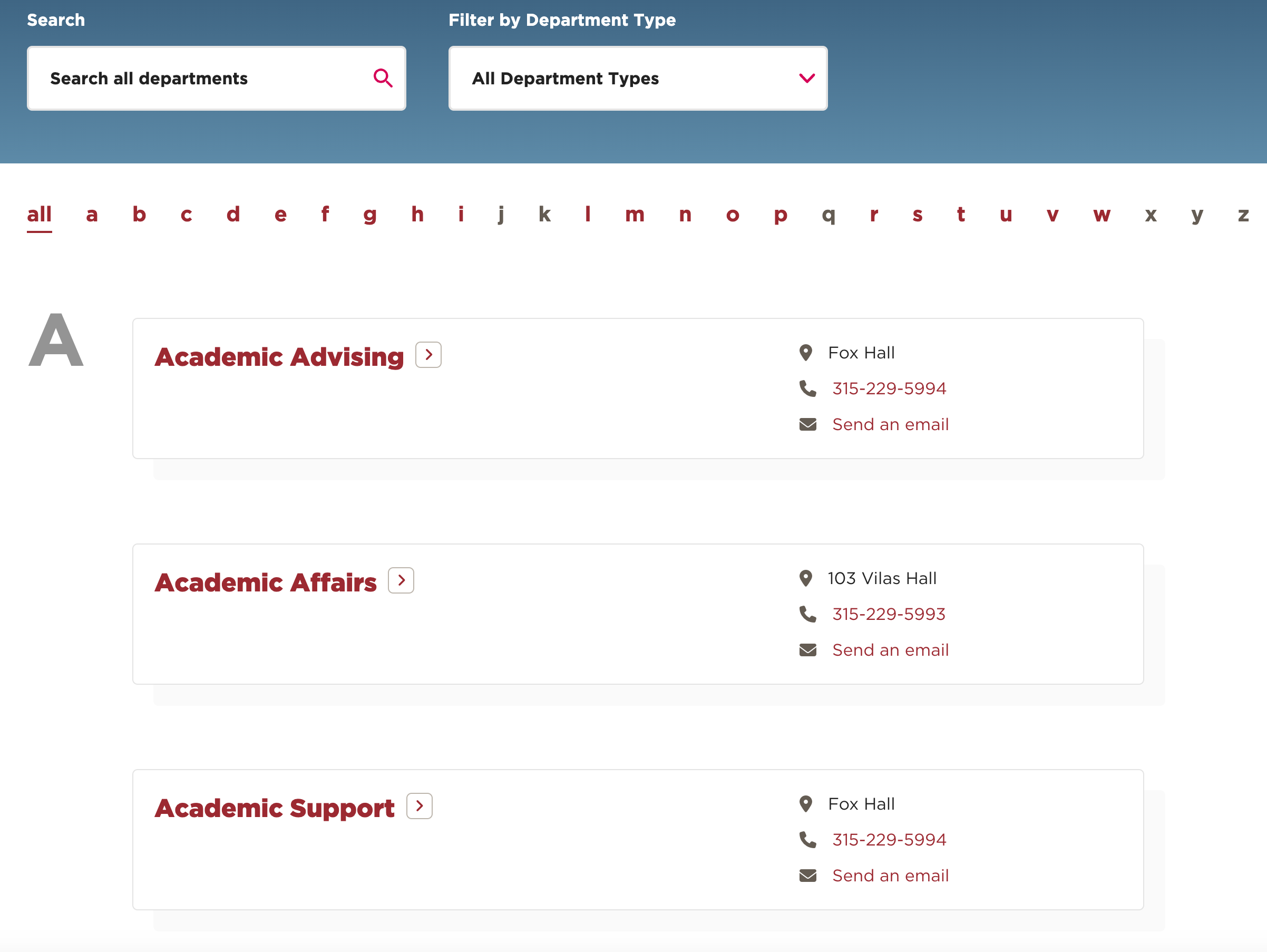
The intention is good, sure – put all of the resource options you know about on one page – but the execution is oh so bad. Take a look at just one example I’ve provided below:

I know you know how common this type of flat directory is. You might even be thinking, “That’s the kind of directory we have at [fill in the blank]. This approach to directory information must have some perks… at least to some people within the organization…
- like those who have been there for ten years…
- or who already know which office can assist with which concern…
- or those who are already familiar with the names and locations of the buildings…
But yikes, that list of “some people” is getting pretty small and uncomfortably elite.
Resource directories are supposed to help users find the information they need easily, efficiently, and equitably. But if this were the case, the IDC’s Information Worker Survey report (2021) would not be reporting that a worker spends roughly 30% of their workday – 2.5 hours out of the day, searching for information. One reason for this is that most directories unintentionally require the user to know certain information prior to searching.
Here are some of the assumptions flat directories make:
- Users should already know the name of the office or department they need help from
- Users will want to read more information about a resource by clicking link after link
- Users are familiar with building names within your organization
- Users will keep trying if they don’t find the right resource the first time
- Users are looking for one, specific resource result, instead of various options
You can see where I’m going here, right? Flat resource directories are made for users that come from a certain mold. As stated in The High Cost of Not Finding Information, “There’s still a huge gap between what most information systems can do and what users expect.” Flat resource directories are simply not helpful for a variety of users that veer from the standard search path, or have a nontraditional relationship with the organization, and don’t take into account the new and improved ways that people are trying to find the help they need.
Some examples of people for whom flat resource directories are not ideal:
- Young adults
- First generation college students
- Users who are one-step-removed from the organization, like parents or caregivers
- Individuals in need of web accessibility
- People from other countries who might not be familiar with our naming systems
- Someone looking for support for the first time
- People who lack connection with someone who has “insider” knowledge
I first learned of the limitations associated with flat resource directories and unhelpful search field boxes when I was a case manager at a private college in upstate NY. My role was to help students navigate their way through the university system and to point them in the direction of support resources based on their concern.
One year into the role, the number of students coming to my office increased 141%. I was the compass for these students, the one answering “easy” questions like, “Where do I drop a class?” or “How do I change roommates”? In 2011 it occurred to me that the University was rich with valuable resources, but that students (and their parents) had no clue where to find them!
That’s when I developed ConcernCenter.
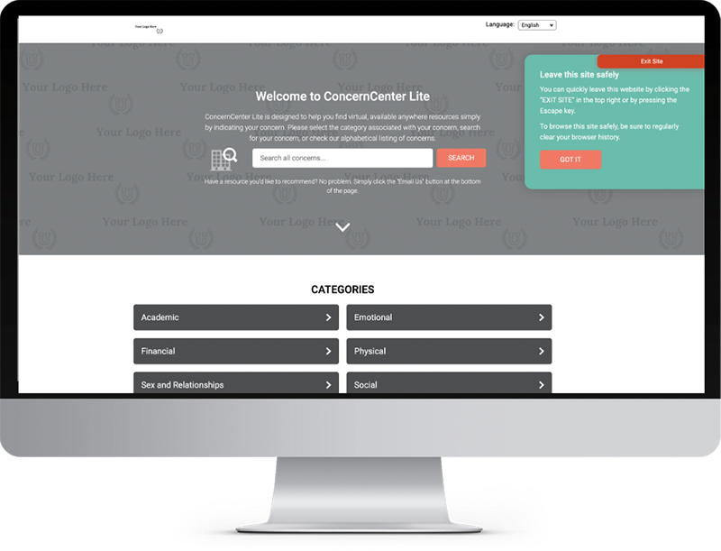
In any ideal resource directory system, the user is at the forefront of the search experience. All the user should be required to know is, “What am I struggling with”? Upon identifying their concern, the resource directory should populate various, relevant, resource results that are intended to support the user with their specific concern.
Here’s an example.
If I type, “I can’t stand my roommate” into a college or University version of ConcernCenter, I would expect to receive the following results:
- Phone number, email address, website, GPS coordinates and other pertinent information about the Residential Life main office
- A reminder that I can speak with my Resident Assistant if I haven’t already
- A video or two about how to manage roommate conflict
- A downloadable roommate-change request form used by the University
- A link to the Universities upcoming roommate-finder event happening next month
If I type, “I am really depressed” I’d expect to see:
- Crisis text lines
- Crisis phone numbers
- A resource card for the Counseling Center
- A resource card for the Spirituality Center
- A resource card for University Health Services
- A link to the ActiveMinds mental health club on campus
- Video content
- App suggestions
- Links to relevant articles regarding symptoms of depression
User-focused resource directories make the process of finding help as easy as telling someone what’s wrong. They are also multi-lingual, web accessible, offer quick escape capabilities, the ability to connect with an anonymous reporting form, and maintained regularly (did you know that 85% of consumers found incorrect or incomplete information on a resource listing in 2021 according to Business Listings Trust Report?) Thankfully, ConcernCenter offers all of those options, and more. At a price that makes the decision, equally as easy.
Users of directory services are looking for an easier way to connect with the support they need, right now. Every moment spent updating a flat resource directory site means an administrator, like I used to be, continues to spend their time on resource navigation instead of the work they were hired to do. It also means that people in your care are struggling to find the help they need, when they need it.
The answer exists.
The answer is not flat.
It’s time to start thinking differently about how we direct users to the information they need.
Want to read more on this topic? Check out this recap of a recent event we hosted related to connecting students with key resources.
What to schedule a demo or receive a price quote for ConcernCenter? Visit www.concerncenter.com.


